Description
I was tasked with collaborating with my friend Michelle to create a brand identity for the Spartan Media Group, the overarching entity which covers all of the media publications within the School of Journalism and Mass Communications at San Jose State University.
Throughout the course of this project I primarily worked on the logo while Michelle worked on the colors, fonts and other elements of the brand identity. The work pictured here is almost exclusively of my own creation.
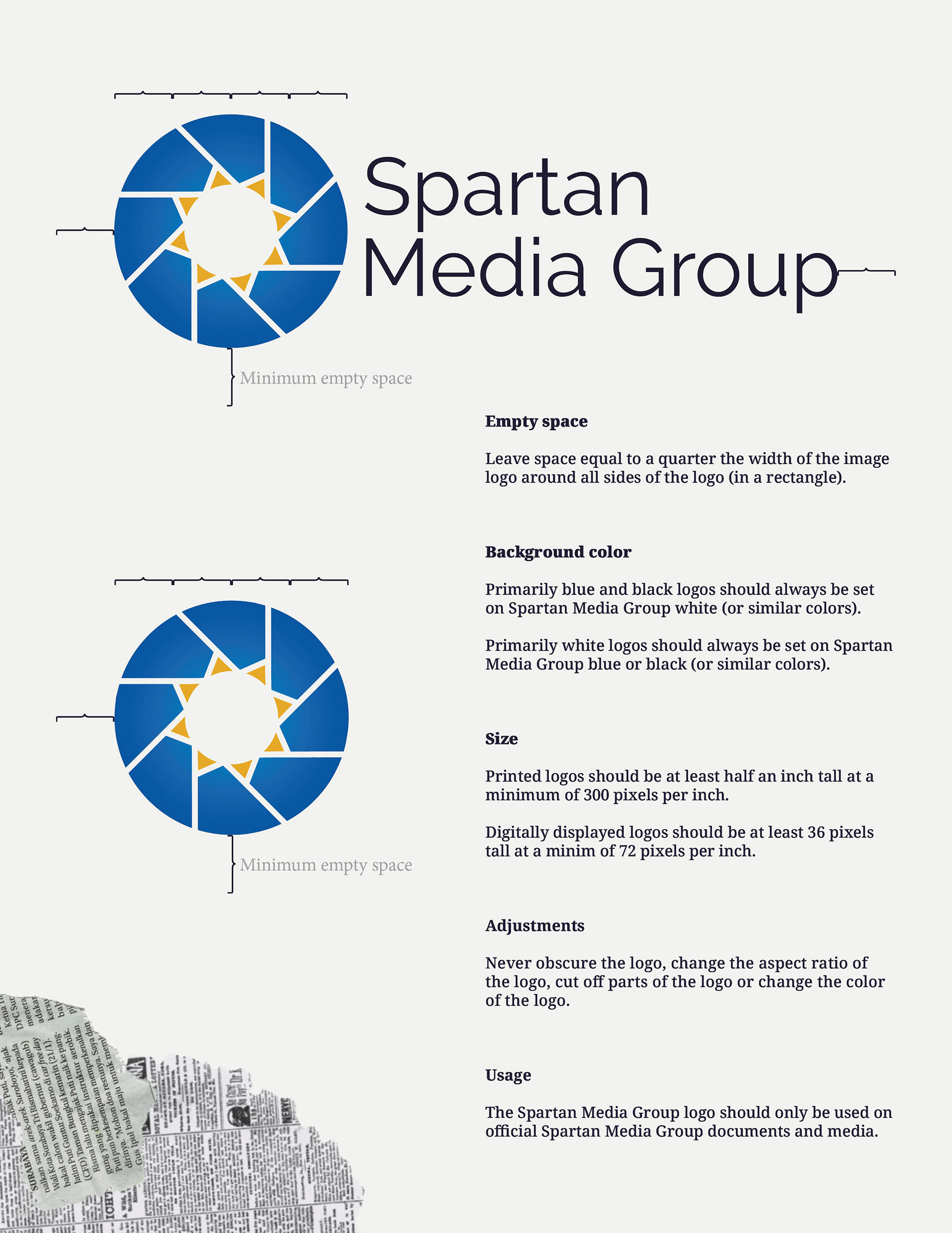
The logo is intended to be simple enough as to be usable for a variety of different applications, however there is a lot of thought behind it. The 8-sided logo alludes to the 8 publications within the Spartan Media Group and the camera shutter is a recognizable image for anything media-related. The colors are based on SJSU's school colors with a gradient added for depth. The yellow triangles on the interior of the logo allude to the crest of SJSU's logo and are intended to look like a sun.
Michelle and I also developed new names for several rooms around the School of Journalism and Mass Communications building as part of the establishment of the Spartan Media Group. The point of this is to build upon the JMC's existing brand identity and to make these key rooms more memorable for JMC students.
Color Theme
Logos
Full Logo Guidelines


Renamed Room Graphics





Process
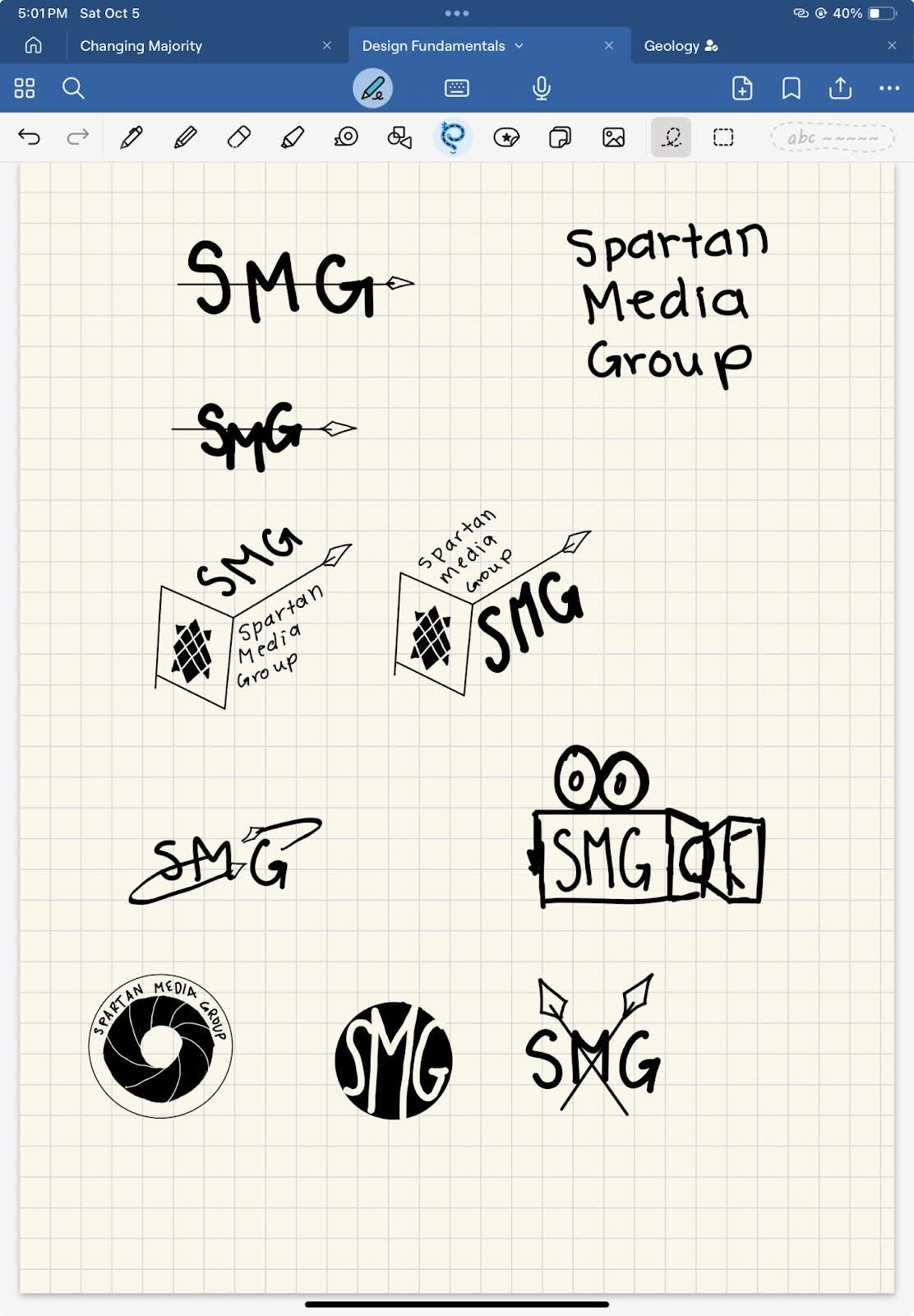
Michelle and I started the project by brainstorming logos. Her brainstorming is pictured on the left.

Process 2













Process 3
